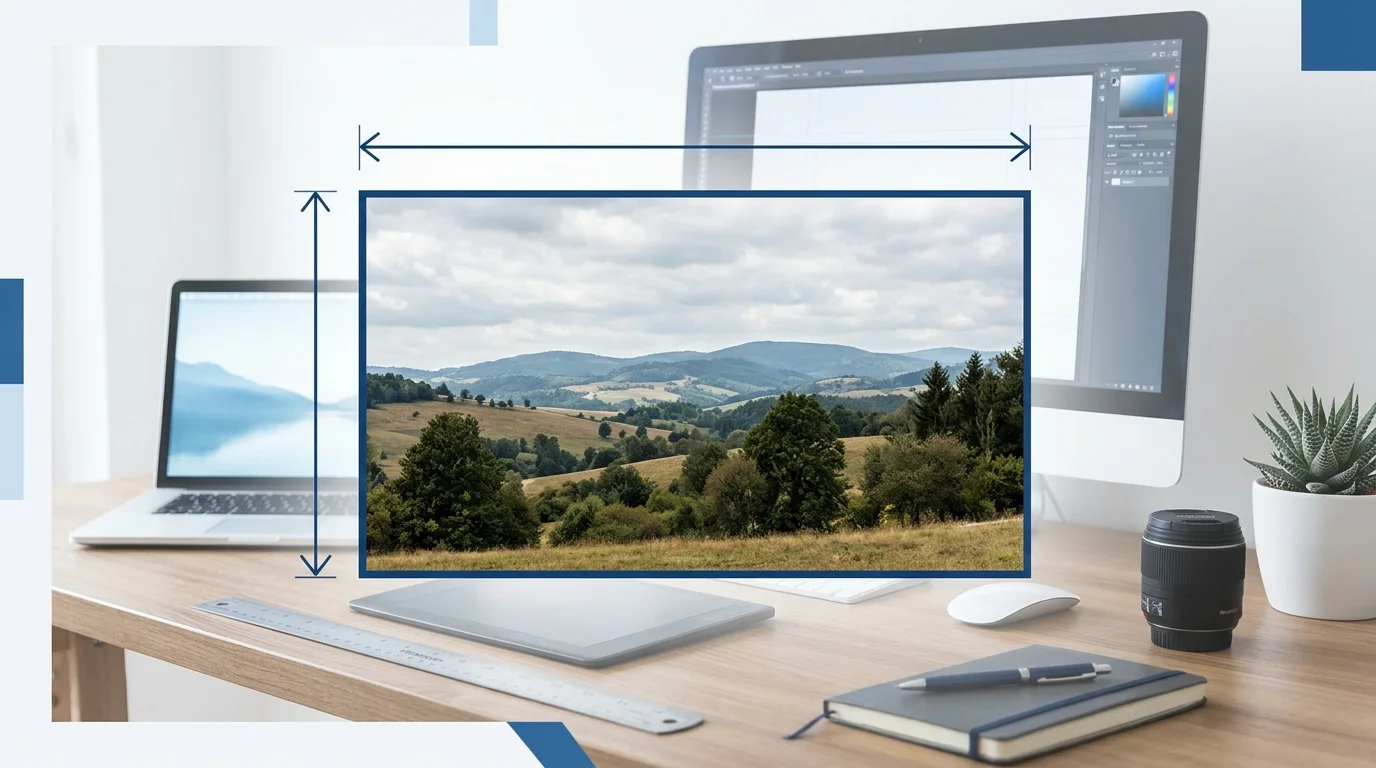
When writing dimensions, width or height first depends on the format, industry, and purpose. In most common situations, width comes before height. For example, an image that is 1200 pixels wide and 675 pixels tall is written as 1200 × 675 pixels (width × height).
However, some fields use a different order. Paper sizes, furniture measurements, and product dimensions may follow their own conventions. The key is to understand what each number represents and use the same order throughout your work.
In this guide, you will learn If to write width or height first, how to list dimensions correctly, and which format works best for images, websites, printing, and everyday measurements. You will also find clear examples, common mistakes, and simple tips to make your writing easier to understand.
Width or Height First: Quick Answer
In most digital design and image formats, width comes first, followed by height.
The standard format is:
Width × Height (W × H)
For example:
- 1200 × 675 pixels = 1200 pixels wide and 675 pixels tall.
- 1920 × 1080 pixels = 1920 pixels wide and 1080 pixels tall.
- 800 × 600 pixels = 800 pixels wide and 600 pixels tall.
Width measures how far something extends from left to right. Height measures how far it extends from top to bottom.
However, this is not a universal rule for every type of measurement. When measuring a box, furniture, or other physical object, you may see length × width × height (L × W × H).
The best approach is to check the format or instructions for the specific task.
What Does Width Mean?
Width is the measurement of how wide something is. It usually describes the distance from one side to the other, moving from left to right.
For example, imagine a picture hanging on a wall. The distance from its left edge to its right edge is its width.
Width is commonly measured in:
- Pixels (px) for digital images
- Inches (in) for printed materials
- Centimeters (cm) for physical objects
- Meters (m) for larger spaces
Here are some simple examples:
- A photo is 1200 pixels wide.
- A table is 100 centimeters wide.
- A window is 5 feet wide.
- A website content area is 900 pixels wide.
Width helps you understand how much horizontal space something needs.
For example, if you create a website image that is too wide, it may not fit properly on a mobile screen. If you make it too narrow, it may look small or leave too much empty space.
Understanding width is important when designing images, websites, banners, and printed materials.
What Does Height Mean?
Height is the measurement of how tall something is. It usually describes the distance from the bottom to the top.
For example, the distance from the bottom edge of a picture to its top edge is its height.
Height is commonly measured in pixels, inches, centimeters, or meters.
Examples include:
- A photo is 675 pixels tall.
- A door is 200 centimeters tall.
- A person is 5 feet 6 inches tall.
- A website banner is 300 pixels tall.
Height helps you understand how much vertical space something needs.
For example, if you create a tall image for a website, it may take up more screen space than expected. A shorter image may be better for a banner or header.
Width and height work together to describe the full size of an image or object.
Understanding Width and Height: Meaning and Measurement
Width and height describe two different directions.
Width measures the horizontal distance, while height measures the vertical distance.
| Feature | Width | Height |
| Meaning | How wide something is | How tall something is |
| Direction | Left to right | Bottom to top |
| Common symbol | W | H |
| Position in image dimensions | Usually first | Usually second |
| Example | 1200 pixels | 675 pixels |
For example, an image with dimensions of 1200 × 675 pixels has:
- Width: 1200 pixels
- Height: 675 pixels
The image is wider than it is tall, so it is a landscape image.
Now consider an image with dimensions of 675 × 1200 pixels.
- Width: 675 pixels
- Height: 1200 pixels
This image is taller than it is wide, so it is a portrait image.
The numbers may look similar, but changing their order changes the shape of the image.
How to Write Dimensions Correctly
The correct way to write dimensions depends on what you are measuring.
For digital images, the most common format is width × height.
For physical objects, you may need three measurements: length, width, and height.
Here are the common formats:
| Type of Measurement | Common Format | Example |
| Digital image | Width × Height | 1200 × 675 px |
| Website banner | Width × Height | 1920 × 600 px |
| Portrait photo | Width × Height | 800 × 1200 px |
| Box or package | Length × Width × Height | 30 × 20 × 15 cm |
| Room dimensions | Length × Width | 5 × 4 m |
| Screen resolution | Width × Height | 1920 × 1080 px |
The multiplication symbol (×) is commonly used between measurements. You may also see a lowercase “x” used in plain text.
For example:
- 1200 × 675 pixels
- 1200 x 675 pixels
Both are understandable, but the multiplication symbol is more polished in formal writing.
When writing dimensions, always include the unit if it is important.
For example, 1200 × 675 is less clear than 1200 × 675 pixels.
The unit tells the reader If the numbers refer to pixels, centimeters, inches, or another measurement.
Should Width or Height Come First for Images?
For most digital images, width comes first and height comes second.
This format is widely used in graphic design, web development, image editing, and digital publishing.
For example:
- 1200 × 675 pixels
- 1600 × 900 pixels
- 1920 × 1080 pixels
- 1080 × 1920 pixels
The first number represents the horizontal size. The second number represents the vertical size.
This order is useful because it helps you identify If an image is landscape, portrait, or square.
A landscape image has a greater width than height.
A portrait image has a greater height than width.
A square image has equal width and height.
For example, a 1200 × 1200 pixel image is square.
When you create images for websites, blogs, social media, or presentations, using width × height makes the dimensions easier to understand.
Width or Height First for Website Images?
Website images usually follow the width × height format.
This is especially important for blog feature images, banners, thumbnails, and other visual content.
For example, if you create a blog feature image with a size of 1200 × 675 pixels, the image is 1200 pixels wide and 675 pixels tall.
This size has a 16:9 aspect ratio, which is commonly used for landscape images.
Here are some example dimensions for website images:
| Image Type | Example Dimensions | Aspect Ratio |
| Blog feature image | 1200 × 675 px | 16:9 |
| Wide website banner | 1920 × 600 px | 16:5 |
| Square thumbnail | 800 × 800 px | 1:1 |
| Portrait image | 800 × 1200 px | 2:3 |
| Landscape blog image | 1600 × 900 px | 16:9 |
These are examples, not fixed requirements. The best dimensions depend on your website’s design, image quality, and layout.
For a blog feature image, width × height is usually the easiest format to use.
When requesting a 16:9 image, you can write:
“Create a landscape feature image with a width of 1200 pixels and a height of 675 pixels.”
This wording makes the dimensions clear.
Width or Height First for Physical Objects?
When measuring physical objects, the order may be different from the order used for digital images.
For example, a box is often measured using length × width × height.
This format describes three dimensions:
- Length: How long the object is.
- Width: How wide the object is.
- Height: How tall the object is.
Imagine a storage box that measures 30 centimeters long, 20 centimeters wide, and 15 centimeters tall.
You would commonly write:
30 × 20 × 15 cm (L × W × H)
The letters help explain what each number means.
However, not every product uses the same order. Some products may list width × depth × height, especially furniture.
For example, a desk might be listed as:
120 × 60 × 75 cm (W × D × H)
Here, depth describes how far the desk extends from the front to the back.
This is why it is important to check the labels or measurement instructions before assuming the order.
Width or Height First for Printing?
When preparing images for printing, width and height are usually listed in that order.
For example, a printed photo may have dimensions of 8 × 10 inches.
However, the order can depend on how the size is described.
An 8 × 10 inch photo usually means 8 inches wide and 10 inches tall when displayed in portrait orientation.
A 10 × 8 inch photo usually means 10 inches wide and 8 inches tall when displayed in landscape orientation.
Both sizes describe the same overall area, but their orientation is different.
Here are some common print sizes:
| Print Size | Common Orientation | Width × Height |
| 4 × 6 inches | Landscape | 6 × 4 inches |
| 5 × 7 inches | Portrait | 5 × 7 inches |
| 8 × 10 inches | Portrait | 8 × 10 inches |
| 11 × 14 inches | Portrait | 11 × 14 inches |
| 16 × 20 inches | Portrait | 16 × 20 inches |
The table shows common print dimensions, but actual orientation can vary.
For example, an 8 × 10 inch print can also be displayed in landscape orientation if rotated.
When preparing an image for printing, always check the printer’s required dimensions and orientation.
Does Width or Height Affect Aspect Ratio?
Yes. Width and height determine the aspect ratio of an image.
An aspect ratio describes the relationship between an image’s width and height.
For example, a 1200 × 675 pixel image has a 16:9 aspect ratio.
This means the image is 16 units wide for every 9 units tall.
The aspect ratio can help you choose the correct image shape for a website, video, or social media post.
Here are some common aspect ratios:
| Aspect Ratio | Example Dimensions | Common Use |
| 1:1 | 1000 × 1000 px | Square images |
| 4:3 | 1200 × 900 px | Traditional photos |
| 16:9 | 1200 × 675 px | Blog feature images and videos |
| 9:16 | 675 × 1200 px | Vertical videos |
| 3:2 | 1200 × 800 px | Photography |
Changing the width or height without keeping the same aspect ratio can stretch or distort an image.
For example, if you change a 1200 × 675 image to 1200 × 900 without cropping or adjusting the image properly, the image may look stretched.
To keep an image looking natural, maintain its original aspect ratio whenever possible.
Common Mistakes When Writing Width or Height First
Many people make small mistakes when writing dimensions. These mistakes can cause confusion, especially in design, printing, and website development.
Here are some common errors and how to avoid them.
Mistake 1: Reversing Width and Height
Incorrect: A 1200 × 675 image is 675 pixels wide and 1200 pixels tall.
Correct: A 1200 × 675 image is 1200 pixels wide and 675 pixels tall.
The first number usually represents width in digital image dimensions.
Mistake 2: Forgetting the Measurement Unit
Incorrect: The image size is 1200 × 675.
Better: The image size is 1200 × 675 pixels.
Adding the unit makes the measurement clearer.
Mistake 3: Confusing Width With Length
Width and length can mean different things when measuring physical objects.
For example, a box may use length × width × height, while a digital image usually uses width × height.
Do not assume the same order applies to every type of measurement.
Mistake 4: Ignoring Orientation
A 1200 × 675 image is landscape, while a 675 × 1200 image is portrait.
Reversing the numbers changes the image’s orientation.
Mistake 5: Changing Dimensions Without Keeping the Aspect Ratio
If you change an image’s width and height independently, the image may look stretched or compressed.
Keep the original aspect ratio unless you intentionally want to crop or reshape the image.
Mistake 6: Assuming Every Industry Uses the Same Order
Image dimensions, furniture measurements, and product sizes may follow different conventions.
Always check the format required by the specific task.
Tips for Writing Width and Height Clearly
If you want your dimensions to be easy to understand, follow a few simple tips.
First, use width × height for digital images unless the software or platform specifies another format.
Second, include the unit of measurement. For example, write 1200 × 675 pixels rather than just 1200 × 675.
Third, use labels when measuring physical objects. Writing 30 × 20 × 15 cm is less clear than writing 30 × 20 × 15 cm (L × W × H).
Fourth, check the aspect ratio before resizing an image. This helps prevent unwanted stretching.
Finally, stay consistent. If you use width × height in one part of a document, use the same order throughout the document unless there is a clear reason to change it.
These simple habits make your measurements more accurate and easier for others to understand.
FAQs About Width or Height First
1. Should width or height come first?
Width usually comes first, followed by height. This is the common format for digital images, screen resolutions, and website graphics. For example, 1200 × 675 pixels means 1200 pixels wide and 675 pixels tall.
2. Is width written before height in dimensions?
Yes, width is generally written before height when describing digital images. However, physical objects may use a different format, such as length × width × height. Always check the measurement convention for the item you are describing.
3. What does 1200 × 675 mean?
For a digital image, 1200 × 675 usually means the image is 1200 pixels wide and 675 pixels tall. It has a 16:9 aspect ratio and is wider than it is tall, making it a landscape image.
4. Is width the same as length?
No. Width and length describe different measurements. Width usually refers to the distance from left to right, while length often describes the longest side of an object. The exact meaning can depend on the type of measurement.
5. Does height come before width for portrait images?
Not usually. Even for portrait images, the common format is still width × height. For example, a portrait image may be 675 × 1200 pixels. The height is greater than the width, but width is still listed first.
6. How do I write width and height in a sentence?
You can write dimensions in a sentence by naming each measurement clearly.
For example:
“The image is 1200 pixels wide and 675 pixels tall.”
You can also write:
“The image measures 1200 × 675 pixels (width × height).”
Both forms are clear and easy to understand.
Conclusion: Width or Height First?
When deciding If to write width or height first, remember that width usually comes before height in digital image dimensions. For example, 1200 × 675 pixels means the image is 1200 pixels wide and 675 pixels tall.
However, physical objects may follow a different measurement order. A box may use length × width × height, while furniture may use width × depth × height.
The most important thing is to make your measurements clear. Use the correct units, label each dimension when needed, and follow the format required for your task.
If you are creating website images, banners, or blog feature graphics, width × height is generally the best format to use. When measuring physical objects, check the product’s instructions.

Hi, I’m Iqra, a passionate writer and grammar enthusiast dedicated to making English grammar simple, clear, and easy to understand. Through my work on grammar books and educational content, I help students, writers, and English learners improve their vocabulary, sentence structure, punctuation, and everyday communication skills. My goal is to turn confusing grammar rules into practical, easy-to-follow lessons that readers can confidently use in real life. I believe learning grammar doesn’t have to be difficult—it can be simple, useful, and even enjoyable. Through helpful guides, examples, and carefully explained grammar tips, Iqra aims to make learning English more accessible for everyone.